
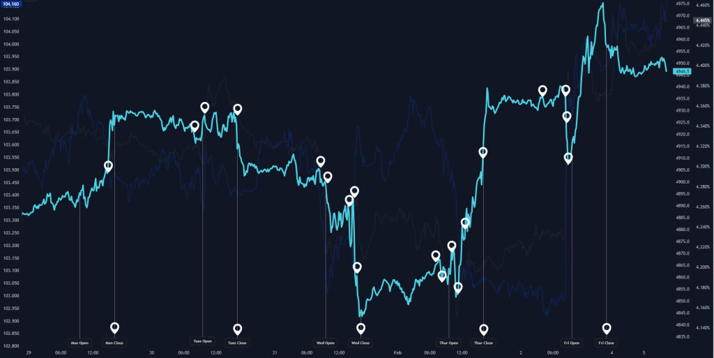
Investing in the stock market is often akin to a roller coaster ride — thrilling highs, nerve-wracking drops, and sometimes periods of steady cruising. To make informed decisions, investors need to understand the underlying factors influencing market movements. An interactive event breakdown chart is a powerful tool in this regard. Let’s dissect the market behaviour for the week starting January 29th, as depicted by this intriguing financial instrument.
The week kicked off on a positive note, with the market opening on Monday showcasing a buoyant trend. The chart captures this with an upward trajectory, suggesting a surge of buying activity or a favourable response to weekend developments or announcements. This bullish start is often a reaction to several factors, including corporate earnings releases, geopolitical stability, or simply investor sentiment swinging to the more optimistic side of the spectrum.
As we progress to midweek, the chart reveals a series of peaks and troughs, indicating a period of heightened volatility. Each circled event likely corresponds to significant market-moving news or economic data releases. Such fluctuations could be the result of a variety of catalysts, such as:
- Earnings Reports: Companies releasing their quarterly results can lead to immediate reactions in their stock prices.
- Economic Indicators: Data like inflation rates, employment statistics, or consumer confidence can shift market mood swiftly.
- Global Events: International developments, such as central bank announcements or trade agreement negotiations, can have a ripple effect across global markets.
Investors are known to react quickly to such events, buying on good news or selling on bad, which creates the zigzag patterns we observe.
Thursday’s market opens with a significant spike, hinting at a major event that could have been anticipated the evening before or occurred just as the market opened. This could range from a surprise earnings success from a market heavyweight to a positive turn in economic policy. Such a spike can trigger a frenzy of activity as traders seek to capitalize on the momentum, with some cashing in on gains and others jumping on the bandwagon hoping for continued upside.
As the week draws to a close, we often see a cool-down period, and the chart suggests a similar pattern with a slight downtrend as the market approaches the Friday close. This cooling off could be due to traders securing their positions before the weekend, taking profits from the week’s earlier gains, or a lack of significant market-driving events allowing for a more natural, perhaps bearish, market correction.
The chart features two axes, with different scales and likely representing correlated asset classes or a benchmark index alongside a specific stock or sector. The dual axes allow us to compare the relative performance of two different data sets. For instance, we might be looking at the tech sector in relation to the broader S&P 500 index, observing how specific events impact one more than the other.
Analysing an event breakdown chart like this provides a narrative of market sentiment, highlighting the cause and effect of price movements. For the week of January 29th, the story is one of early optimism, midweek unpredictability, a Thursday crescendo, and a Friday decrescendo. By studying such charts, investors and traders can better time their entry and exit points, understand market dynamics, and ultimately, make more educated investment decisions.
In the world of finance, knowledge is indeed power, and the ability to interpret such charts is a valuable skill in any investor’s arsenal. Whether you’re a seasoned trader or a novice investor, keeping an eye on such detailed market analyses can help steer through the tumultuous waters of the stock market with greater confidence and insight.
Source: Click here (also includes a interactive chart)


Leave a comment