
Economic recessions are a natural part of market cycles, but predicting them can often feel like trying to read tea leaves. With all the noise in the media, it’s easy to get caught up in the panic of “It’s coming, it’s coming!” But how accurate are these predictions? And what if the data itself could provide us with a clearer picture?
One tool that attempts to do just that is a recession indicator that analyzes economic data like stock market returns, the yield curve, and inflation to predict potential recessions. Let’s break down how this indicator works and what it can tell us about the state of the economy.
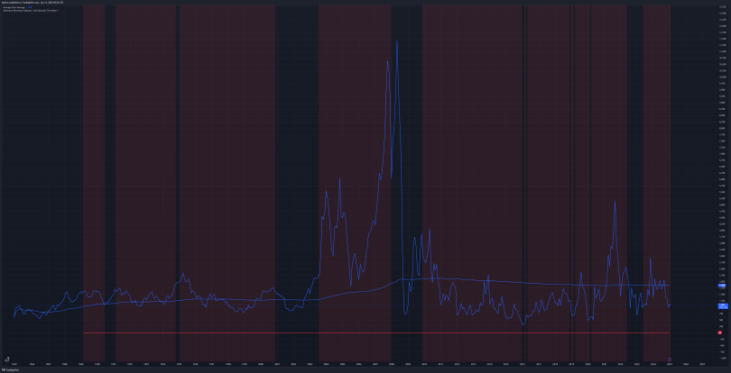
The Data Breakdown
In this particular recession prediction model, we see three main elements represented on the chart:
- The Blue Line (Market Price): This is the current market price, representing where things stand in real-time. It shows how the market is performing, reflecting investor sentiment and overall economic health.
- The Blue Line Going Through the Price (Historical Average Price): This line represents the historical average price. By comparing the current market price to this average, we get a sense of whether the market is overvalued or undervalued, providing context for where we are in the market cycle.
- The Red Line (Smoothed Recession Score): This is the smoothed recession score, calculated based on various economic indicators. It gives a clearer picture of the overall trend, smoothing out the noise and showing the bigger picture of whether the economy is moving toward a recession.
- The Red Boxes (Recession Predictions): These red boxes highlight periods when the recession score crossed a certain threshold, signaling that a recession could be imminent. Historically, these boxes align with actual recessions or periods where the economy experienced a slowdown.
Why Do Recessions Happen? And Why Haven’t We Had One Yet?
Zooming into the data, you can clearly see why recessions happen—or don’t. The gaps between the red boxes represent a “pause” in the economy, where the market stabilizes, money moves, and various economic factors adjust. These pauses can delay or prevent recessions from occurring, even when the data suggests one might be coming.
Looking at the chart, it’s easy to see why some people are constantly predicting a recession. The indicators often point to one, yet we’re still here, five years without a major downturn. This leads to the big question: Why hasn’t it happened yet?
It’s hard to predict. The data can show us that conditions are ripe for a recession, but markets are complex, and sometimes they take longer to adjust than we expect. There’s always a lot of uncertainty involved.
But, when you step back and look at the overall trend, the idea that a recession is coming becomes hard to ignore. Even when all the signs are pointing to one, like the red boxes on the chart, it doesn’t always materialize right away. The data just shows us the potential, not the certainty.
Are There Micro Recessions?
This leads to an interesting thought: Are there micro recessions happening that we just don’t notice? Could a recession be sector-specific, only affecting certain industries or markets, while the broader economy continues to move along? Perhaps what people remember as a “recession” is really just a localized downturn that, when it hits the wider market, is seen as a larger event.
In other words, a “micro” recession in one area might not be immediately apparent, but over time, it could snowball into something bigger. This could explain why some industries face downturns while the broader market remains stable.
How the Indicator Works
The indicator itself uses a combination of economic data to calculate the recession score. Stock market returns, the yield curve (the difference between short- and long-term interest rates), and inflation are the main factors in this calculation. When these signals point to economic stress, the score increases.
Once the score crosses a certain threshold, the background of the chart turns red, signaling a possible recession. The threshold is dynamically adjusted based on historical data, ensuring that the model adapts over time for improved accuracy.
The smoothed score helps to reduce the noise in the data, making it easier to identify long-term trends and avoid getting lost in short-term fluctuations. This approach helps to provide a clearer picture of whether a recession is likely or just a temporary blip in the economy.
The Lag Factor
One important thing to keep in mind when looking at this indicator is that it has a lag. It’s based on historical data, so there’s always a delay between the economic events it’s tracking and when the predictions actually appear. This lag is part of the process—using past data to understand what might happen next.
While the lag can be frustrating for those seeking immediate answers, it’s also what makes the indicator useful. It allows us to understand broader trends and economic cycles, even if it’s not always right on time.
A Tool for Understanding Economic Cycles
The recession indicator is far from perfect, but it’s a helpful tool for understanding the economic landscape. It helps us see when a recession is likely based on key economic signals, while also providing insight into why recessions may be delayed or muted.
Despite the inherent lag and imperfections, this model provides valuable context for understanding the ebb and flow of the economy. By analyzing historical data and smoothing out the noise, we get a clearer picture of where we stand and what might be coming next.
In the end, the main takeaway is that recessions are complex, and predicting them isn’t an exact science. But tools like this help us make sense of the signals, and perhaps more importantly, help us recognize that economic downturns might not always be as straightforward as they seem.
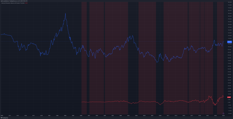
BDI Monthly
DXY Monthly


Leave a comment